
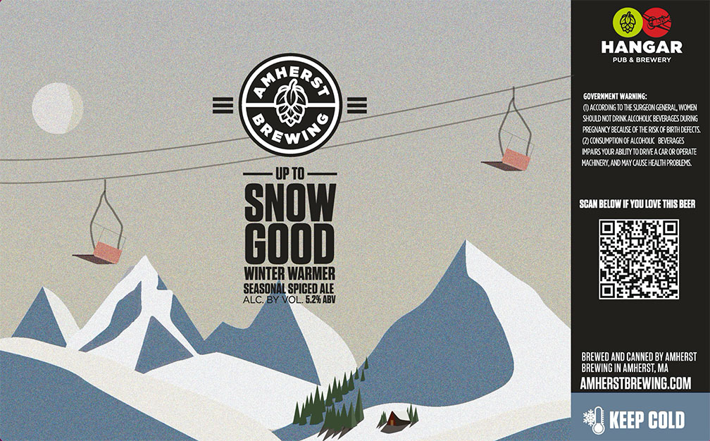
“Up to Snow Good” for Amherst Brewing
My creative inspiration covers a wide spectrum – some notable staples are my love of 70’s rock music, Director Wes Anderson, finding a balance between modernism and retro designs, traveling, and the color white.
The original piece was created in Adobe Illustrator.
Every label tells a story…. Here’s the artist’s story
What is your art background like?
Ever since I was little, I’ve always loved to draw and paint and luckily I had a natural talent for it. When I got to high school, that’s when I really embraced my creative side. I was very fortunate to attend a public high school that understood how crucial the arts were and there I was able to take AP Art and Advanced Video courses towards my junior and senior year. My teachers were so incredible, huge heroes of mine, and definitely inspired me to keep venturing on this creative path.
At Westfield State University, I minored in art, took many drawing classes and then found my new love of graphic design. Thinking about my future and how I can pair something with my communications major degree, I thought graphic design would be the perfect skill to enhance my chances of working in an artistic marketing role.
After graduating in 2015 and earning my B.A degree, I’ve been heavily advancing in my design skills thanks to my experience. Before my full-time job at Amherst Brewing, I worked as a Marketing and Project Manager for a Business Improvement District for 6 years. There I combined my marketing, graphic design, social media, planning events skills and was able to my connections with Amherst Brewing through an event I had planned/designed.
Since November of 2021, I’ve been with Amherst Brewing, and have now designed over 30 beer labels for them. I absolutely love my job, it’s a dream come true to design beer can labels.
What inspires you as an artist?
My creative inspiration covers a wide spectrum – some notable staples are my love of 70’s rock music, Director Wes Anderson, finding a balance between modernism and retro designs, traveling, and the color white.
What do you hope viewers will feel/experience when they view your art?
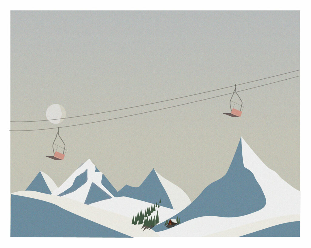
Designing beer labels, you have to be very versatile. This design/beer in particular was designed to be enjoyed during the winter time. Being from New England, that’s a huge part of our lives and I hoped this design ignited some memories and enjoyment we all had or have during the winter because winter can be a little brutal sometimes.
Does this particular piece have a backstory you could share?
A big part of my job is also assisting in the names of our beer. We knew we were making a spiced ale to enjoy during the colder months. I played around with a bunch of different names such as Snowed In, Open all Winter, Frosty etc. but Up to Snow Good just really stuck out to us.
I knew I wanted the majority of the label to be snow, so I immediately thought of a ski resort (definitely fits with our New England community) and love vintage illustrations and pulled inspo from some vintage apres designs.
The completed label incorporating the artwork
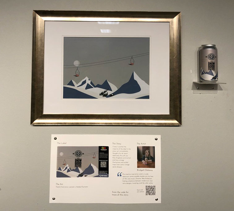
The art, can, label, and caption
Artist Bridgett Delaney
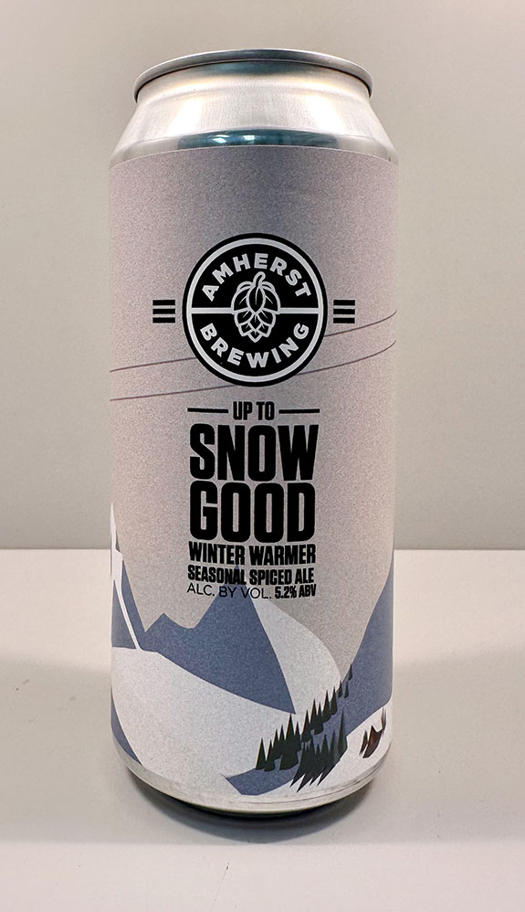
The labeled can
For our 45th anniversary, we created an exhibit entitled “CANVAS” celebrating the art of the can…. Or more specifically, the label art ON the cans of our beer-brewing customers. More about CANVAS
Amherst Label founded 1978 More
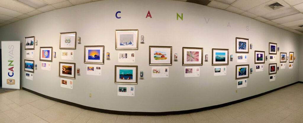
The complete CANVAS exhibit
Every label tells a story….
CLICK to learn more about Amherst Label’s commitment to helping breweries tell their stories.